Mastering a Report for Survey: How to Drive Action and Insights
Discover how to craft a report for survey that turns data into action. Practical steps, templates, and tips to boost response rates and decisions.

A solid survey report does more than present numbers on a slide; it tells a story that drives business decisions. It turns raw customer feedback into a clear narrative with real, actionable steps for your product, marketing, and success teams.
Why Most Survey Reports Get Ignored
Does this sound familiar? Your team spends weeks designing the perfect survey. The responses roll in, you export the data, and someone pulls together a slide deck full of charts and percentages. That report is sent in an email, maybe gets ten minutes of attention in a meeting, and then vanishes into a forgotten folder on the shared drive.

This happens all the time. I've seen many SaaS teams invest heavily in gathering feedback, only for the final report to land with a thud, making zero impact. It ends up as a data dump, not a decision-making tool.
So, where does it all go wrong?
A Disconnect from Business Goals
One of the biggest culprits is a report that lacks a clear purpose tied to business outcomes. A stat showing that 70% of users like a new feature is interesting, but it's just a number. It becomes powerful when it answers a bigger question, like, "How is this feature impacting user retention?" or "Should we double down on development resources here?"
Without that direct link to what the C-suite cares about, stakeholders see the data as "nice to know" but not urgent. The report is floating in a vacuum, making it hard for anyone outside the immediate team to see why they should care.
The Problem with Data Overload
Another classic mistake is cramming too much information into a report without a clear story. A slide deck packed with dozens of charts, tables, and raw numbers is overwhelming. When people don't know where to focus, their eyes glaze over, and they tune out completely.
The goal of a survey report is to highlight the most important insights and explain what they mean for the business, not to show everything you found.
The best reports are selective. They guide the reader through a logical narrative, starting with the most important findings and then backing them up with just enough evidence. A simple data presentation forces the reader to do all the heavy lifting of interpretation, a task most busy stakeholders simply don't have time for.
This leads to a few common problems:
- No Clear Takeaways: The report shows the data but never explicitly states, "Here are the three things you need to know."
- No Actionable Steps: It tells you what users think but fails to recommend what the company should actually do about it.
- Wrong Metrics: The report focuses on vanity metrics instead of data that connects directly to revenue, churn, or customer loyalty.
When a survey analysis avoids these traps, it transforms. It stops being a passive document and becomes a catalyst for real conversations and strategic changes across product, marketing, and customer success.
Know What You're Looking For: Setting Clear Goals and Metrics
Before you think about looking at that spreadsheet of survey responses, stop. Ask yourself one simple question: "What am I trying to accomplish with this report?"
Seriously. A survey report without a clear goal is a pile of numbers looking for a purpose. It's the kind of document that gets skimmed, filed away, and ultimately changes nothing. You’ve put in the work to get the feedback; don’t let it go to waste.
The most effective reports I’ve ever seen were built on a solid foundation of well-defined objectives. This means tying your survey directly to a bigger company priority. Are you trying to figure out why churn ticked up by 5% last quarter? Testing the waters for a new premium feature? The answer to that question will steer every single decision you make from here on out.
Without that focus, you'll find yourself lost in a sea of data. You might discover a few interesting tidbits, sure, but they won't add up to a cohesive story that gets leadership to take action.
Align Your Survey Goals with Business Priorities
Your survey should not exist in a vacuum. It needs to be a tool that helps solve a real, nagging business problem. A great way to get started is by framing your objective as a question that your team desperately needs an answer to.
Here are a few real-world examples I've seen in SaaS:
- The Goal: Pinpoint the exact friction points in the early user experience that are causing people to leave.
- The Goal: Get inside their heads and find out the unmet needs and pricing sensitivities of this new audience.
- The Goal: Gauge actual customer demand and their willingness to pay for each feature to prioritize the product roadmap with confidence.
When you tie your survey to a tangible business outcome, the report you create is suddenly a whole lot more relevant to stakeholders. It stops being "just customer feedback" and becomes a strategic document that informs important decisions.
Pick the Right Tools for the Job: Choosing Your Metrics
Once you know your destination, you need the right instruments to guide you. For SaaS teams, a handful of key performance indicators (KPIs) are consistently valuable. The real trick is knowing which one to use and when.
Think of these metrics as different lenses. Each one gives you a unique view of the customer experience. Using the right one for the right situation is what separates a confusing report from one that delivers crystal-clear insights.
To help you choose the right tool for the job, here’s a quick breakdown of the heavy hitters.
Key Survey Metrics for SaaS Teams
Choosing the wrong metric can send you down a completely wrong path. For example, using a broad NPS survey to measure satisfaction with a tiny UI change is like using a sledgehammer to crack a nut. A quick, targeted CSAT survey would give you a much cleaner signal. On the flip side, using CSAT to measure overall brand loyalty misses the bigger picture that NPS is designed to capture.
By setting clear goals and selecting the right metrics from the get-go, you're building a solid framework for a powerful report. This makes certain every chart you build and every insight you uncover serves a distinct purpose, pushing your team toward data-informed action instead of just more data.
Diving Into the Data: How to Clean and Analyze Your Survey Responses
Once your survey closes, you’re sitting on a mountain of raw data. And let's be honest, it's rarely clean. You'll have everything from half-finished answers and nonsensical text entries to outliers that could completely throw off your results. Cleaning this data is a non-negotiable first step to building a report people can trust.
Think of it like prepping ingredients for a meal. You wouldn't just toss unwashed vegetables in a pot. You have to handle the partial responses, filter out the junk, and sort your audience into meaningful groups before you can even think about finding insights.
First, You Have to Clean House
The whole point of data cleaning is to make sure your dataset is reliable. If you build your analysis on a shaky foundation of flawed data, your conclusions will be just as wobbly. It's the classic "garbage in, garbage out" problem.
Here’s where to focus your cleaning efforts:
- Tackle Incomplete Responses: What do you do with surveys that are only partially filled out? You need to set a rule. A good starting point is to exclude any response that's less than 50% complete. This prevents a handful of half-answered surveys from distorting your overall findings.
- Filter Out Low-Quality Entries: Keep an eye out for red flags. This includes people who blasted through a 10-minute survey in 30 seconds or gave the exact same rating for every single question. Also, look for gibberish in the open-text fields. These entries are just noise, not valuable feedback.
- Ditch the Duplicates: Depending on your survey settings, you might get more than one entry from the same person. Scan for duplicates using email addresses or other unique IDs and keep only the most complete submission from each respondent.
Go Deeper with Audience Segmentation
With your data cleaned up, the real work, and the real fun, can begin. Simply looking at overall averages can be incredibly misleading. The most powerful insights are often hiding in the differences between your user groups.
Segmenting your audience lets you see how experiences vary across your customer base. Try grouping responses by:
- User Plan: Are free-tier users having a different experience than your enterprise clients?
- Time with Company: Do brand-new users run into different roadblocks than veterans who've been with you for years?
- Company Size: Are small businesses using your product in a fundamentally different way than large corporations?
This level of detail is what turns a report from a collection of general observations into a tool for making smart decisions. You might find out that while your overall CSAT score looks healthy, it’s dangerously low for users on a specific plan, flagging a major churn risk you would have otherwise missed.
The real magic happens when you compare segments. Discovering that 85% of new users struggle with a key feature while only 10% of long-term users do tells a crystal-clear story about a broken onboarding process.
It's also worth noting how people are taking surveys these days. Mobile responses have outpaced desktop for five years straight, with almost 60% of all surveys now completed on a smartphone. For any SaaS team, this is a huge signal: your surveys must be mobile-first, with simple questions and quick load times, or you risk people dropping off before they even finish.
Analyze Both the Numbers and the Narrative
Now that you have clean, segmented data, you're ready to start the analysis. This process involves two very different but equally important types of data.
To figure out which metric best aligns with your goals, a decision tree can be a huge help.
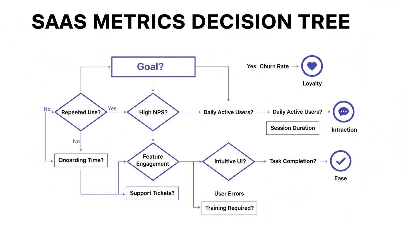
This visual guide helps you connect a primary business goal, like improving loyalty, boosting interaction, or increasing ease of use, to the metric that will measure it most effectively.
For your quantitative data (the numbers), you’re on the hunt for trends, correlations, and anything statistically significant. This is where you calculate your NPS, CSAT, or CES scores and, more importantly, compare them across the different segments you just created. If you want to dig deeper into this, we have a detailed guide on how to analyse survey data effectively.
Then you have your qualitative data (the open-ended text responses). Your job here is to find the story behind the numbers. This usually involves thematic analysis. As you read through the comments, start grouping them into recurring themes. Are people repeatedly mentioning "confusing navigation" or "slow loading times"? Mastering a few reliable qualitative data analysis techniques is key for pulling rich, actionable insights from this text. These themes provide the "why" that gives your quantitative scores context and meaning.
Using Visuals to Tell a Compelling Data Story
Once your data is clean and segmented, it’s time to bring it to life. Let's be honest, a report filled with raw numbers and endless tables will put your audience to sleep. Good data visualization is about transforming that complex information into a clear, simple story that anyone can grasp in seconds.

Think of yourself as a storyteller, not just an analyst. Your charts and graphs are the illustrations in your book. They need to make the narrative more engaging and easier to follow, guiding stakeholders from the initial "why" to the final "what's next."
Choose the Right Chart for the Right Job
The type of visual you choose can make or break your report. Slap the wrong chart in there, and you can easily confuse your audience or, worse, misrepresent the data entirely. It's about what communicates your specific point most effectively, not what looks fanciest.
Here’s a quick guide to the workhorses of data visualization:
- Bar Charts: These are your go-to for comparisons. Use them to show how different user segments answered a question, like stacking up NPS scores between free and paid users. They make differences pop.
- Line Charts: Perfect for showing trends over time. If you run a quarterly CSAT survey, a line chart is the best way to visualize whether customer satisfaction is heading up, dipping down, or just staying flat.
- Pie Charts (and Donut Charts): Use these sparingly. Seriously. Only pull them out when you need to show parts of a whole that add up to a neat 100%. They work best for simple breakdowns with just a few categories, like the percentage of users on different pricing tiers.
And a pro tip: keep your visuals clean. Ditch distracting elements like heavy gridlines, 3D effects, or unnecessary labels. Each chart should have one clear purpose and deliver one key message instantly.
Build a Narrative Around Your Visuals
A collection of pretty charts isn't a story. You have to connect the dots for your audience, explaining what each visual means and how it fits into the bigger picture. This is where you graduate from presenting data to actually delivering insights.
A great way to structure this is to lead with a tight, one-page executive summary. This should hit the absolute highlights: the main goal of the survey, the most important findings, and your top recommendations. It gives busy execs everything they need in minutes.
Your goal is to create understanding, not just show data. Each visual should be accompanied by a brief explanation that answers the question, "So what?"
For instance, after showing a bar chart that reveals a low satisfaction score for your onboarding process, add a sentence or two explaining the business impact. Something like: "This low score among new users directly correlates with our 15% drop-off rate within the first week, highlighting an urgent need to simplify the initial setup." This connects a data point to a real business problem.
If you’re looking to build out a full visual story, it helps to see how all these metrics fit together on a powerful customer experience dashboard.
Avoid Common Visualization Pitfalls
Even with the best intentions, it's shockingly easy to create visuals that confuse more than they clarify. Be mindful of these common mistakes that can completely undermine the credibility of your report.
Here are a few things to watch out for:
- Misleading Axes: Always start your bar chart's Y-axis at zero. Always. Starting it higher can dramatically exaggerate small differences, making them look far more significant than they really are.
- Cluttered Design: Don't try to cram too much information into a single chart. If you're comparing more than five or six categories, a bar chart can become an unreadable mess. Consider breaking the data into multiple charts or just using a simple table instead.
- Inconsistent Colors: Use color with purpose. Stick to your brand's colors for consistency, or use one standout color to draw the eye to the most important data point on a chart. Randomly using a rainbow of colors just creates visual noise.
Ultimately, a strong visual report guides your audience. It helps them see the patterns you've uncovered, understand the implications, and feel confident in the recommendations you’re about to make.
Turning Your Insights into Actionable Recommendations
Let's be honest: an insight without a clear next step is just an interesting fact. It doesn't move the needle. This is the moment your survey report transforms from a passive document into a real tool for change.
Every key finding you've unearthed needs a corresponding recommendation, a specific, measurable action that a team can actually go and do. This is where your analysis translates directly into business value.
From Finding to Action
For every significant insight, your job is to propose a concrete action. Vague suggestions like "improve the user experience" are completely useless. They lack ownership and a clear definition of success.
Imagine this common scenario: your survey data reveals a huge drop-off during user onboarding. A high percentage of new users tick the box for feeling "lost" or "confused" right after their first login.
- The Insight: New users are struggling to find the 'aha!' moment in their first session.
- The Recommendation: The Product Team needs to design and ship three new in-app guides that walk users through core features.
- The Business Goal: Tie this directly to boosting user activation rates by 20% and cutting new-user support tickets by 30% within the next quarter.
See the difference? This approach turns a simple finding into a mini-project plan. It’s specific, it assigns ownership, and it connects the work directly to a business outcome.
Getting Stakeholder Buy-In
Presenting recommendations requires a bit of strategy. You're not just sharing data; you're asking for resources, time, and potentially a shift in priorities. To get leadership on board, you have to frame every suggestion around a business objective they genuinely care about.
Show them the "why" behind your request. Don't just say, "We should fix onboarding."
Instead, try this: "By simplifying our onboarding, we can directly attack our 15% churn rate for first-month users. We estimate this will add $150,000 in ARR over the next year." Now you're talking their language.
This is also where knowing the broader context of survey data helps. In the decade before the COVID-19 pandemic, response rates for major government surveys hovered around 60%. The pandemic, however, knocked that down to below 45%, a trend seen across advanced economies. This decline, highlighted by the Federal Reserve Bank of San Francisco, shows just how tough it is to get actionable feedback. It’s also why tools that capture insights at critical moments, like during a cancellation flow, are so valuable for SaaS teams.
A recommendation is a well-supported business case, not a demand. When you connect your proposed actions to goals like reducing costs, increasing revenue, or improving retention, you're speaking the language of leadership.
By turning your survey insights into clear, measurable, and business-focused recommendations, you make certain your report isn’t just read, it gets acted upon. This is how a simple survey report becomes a powerful driver of growth for your entire company.
Getting Your Survey Reports in Front of the Right People
Building a great report is half the battle. The other half? Making sure the right people actually see it, without you having to chase them down every week. This is where automation comes in. It’s how you get your hard-won insights consistently seen and acted upon, instead of just filed away in a forgotten folder.
The goal is to move away from static, one-off reports and create a continuous flow of customer feedback. This means working smarter, not harder. Instead of manually building the same slide deck every month, you can set up systems that do all the heavy lifting for you.
Set Up Real-Time Dashboards
One of the most effective ways to keep everyone in the loop is with a live dashboard. Tools like Surva.ai can pipe survey data directly into a visual dashboard that updates in real-time. This gives your teams a constant pulse on key metrics like NPS or CSAT without having to wait for a formal report to land in their inbox.
Think of it as a single source of truth. The product team can check it daily to see how a new feature is landing, while the customer success team can watch for dips in satisfaction that might signal churn risk. This simple shift makes customer feedback a visible, daily part of the company's operating rhythm.
Push Insights Where Your Team Already Works
To make sure your findings actually get noticed, you have to meet your team where they are. That means integrating your survey platform with the communication tools they live in every single day, like Slack or Microsoft Teams.
You can set up automated workflows to push important feedback directly to the right channels as it comes in. For example:
- Any NPS detractor response with a score below 4 could be automatically sent to a #customer-feedback channel in Slack.
- Positive feedback mentioning a specific feature could be routed directly to the relevant product manager's team channel.
This immediate visibility helps teams react quickly to both problems and praise. The modern approach often involves leaning on AI to not just deliver the feedback but to summarize it. You can learn more about how AI surveys are changing the game in feedback collection and analysis.
Distributing insights isn't about sharing a file; it's about embedding customer feedback into your company's daily conversations. When feedback becomes a constant presence, it naturally becomes part of the decision-making process.
To truly maximize your efficiency, it's worth exploring other ways of automating repetitive tasks involved in report generation. And remember to tailor the format to your audience. A one-page summary is perfect for busy executives, while a detailed breakdown works best for product teams who need to dig into the specifics.
Got Questions? We've Got Answers
When you're turning a mountain of survey responses into a clear, actionable report, a few common questions always seem to pop up. Let's tackle them head-on.
How Long Should a Survey Report Be?
Honestly, it all comes down to who you're writing it for. There's no magic number.
For your leadership team or C-suite, think short and punchy. A one- or two-page executive summary is usually perfect. They need the highlights: the most important findings, the "so what?" takeaways, and your top recommendations. They don't have time for the nitty-gritty details.
Your product and marketing teams, on the other hand, will probably want to go deeper. For them, a longer report, maybe five to ten pages, makes sense. This gives you room to breathe and include things like segmented data, powerful customer quotes, and a more thorough analysis of the results.
Pro Tip: No matter the length, always lead with the executive summary. That way, everyone gets the key info right up front, and those who need more can keep reading.
What Is the Best Way to Present Qualitative Data?
Open-ended feedback is pure gold, but a wall of text is useless to everyone. The trick is to give it some structure.
Start by grouping all those free-form comments into major themes. You'll quickly see patterns emerge. You might end up with categories like "Onboarding Confusion," "Pricing Concerns," or "Feature Requests for X." This immediately turns chaotic feedback into organized, digestible insights.
Then, bring those themes to life with a few powerful, anonymous quotes. A direct quote can hit harder than any summary you could write. It adds that human element and provides real-world context that numbers alone can't capture.
Word clouds can be a nice visual touch to show frequently used terms at a glance, but don't rely on them alone. They show the what but not the why. Always pair them with your thematic analysis to tell the full story.
How Often Should We Create and Share Survey Reports?
The right cadence really depends on the type of survey you're running.
If you're collecting continuous feedback, like with ongoing NPS or CSAT surveys, you should be checking in on the data regularly. An automated dashboard that you can glance at weekly or review with the team monthly is a great approach. This keeps a constant pulse on customer sentiment without creating a ton of extra work.
For those bigger, less frequent projects, like an annual user satisfaction study, you'll want to create and share a full, comprehensive report shortly after the survey closes.
The most important thing is to get into a regular rhythm. When the rest of the organization knows to expect these insights, they can start building them into their planning and decision-making cycles. That's when your survey reports stop being just documents and start becoming a real strategic asset.
Ready to turn your survey data into actionable insights without all the manual work? Surva.ai helps SaaS teams automate feedback collection, analyze results with AI, and share reports that drive real business decisions. Start building better reports today.
Sophie Moore
Sophie is a SaaS content strategist and product marketing writer with a passion for customer experience, retention, and growth. At Surva.ai, she writes about smart feedback, AI-driven surveys, and how SaaS teams can turn insights into impact.