Mastering Reports For Surveys To Drive SaaS Growth
Learn how to use reports for surveys to transform raw customer data into actionable growth strategies. Get insights on key metrics, visuals, and analysis.

When you're running a SaaS company, raw customer feedback is like a pile of puzzle pieces. A survey report is what snaps them all together, revealing a clear picture that can guide your growth strategy. The goal is to turn scattered opinions into smart decisions that directly boost retention and revenue.
Why Survey Reports Are So Important For SaaS Success
In the crowded SaaS market, guessing what your customers want is a surefire way to fall behind. Think of a well-crafted survey report as your company's GPS. It helps you understand market demands, swerve around hidden potholes like customer churn, and find the most direct path to sustainable growth.

Without a report, all that survey data is just noise: a collection of disconnected comments and ratings. A good report finds the signal in that noise, connecting the dots to show you what's really going on.
Turning Feedback Into A Strategic Advantage
For SaaS teams, these reports become action plans. Different departments can grab these insights to solve real-world problems and jump on opportunities.
- Product Teams can stop guessing and start prioritizing features that users are actually asking for.
- Customer Success Managers can spot at-risk users from their feedback and step in before they even think about canceling.
- Marketing Teams can learn the exact words customers use to describe their problems, making their messaging and campaigns much more effective.
This direct line to your user base has a real, tangible impact on your bottom line. When you systematically listen and act on feedback, you improve the product, improve retention, and increase customer lifetime value. It’s the fastest way to build something the market can't live without.
A survey report is more than a summary of data. It's a tool for alignment, helping every team in your organization focus on the single most important thing: the customer.
The Growing Importance of Survey Tools
This push for better customer feedback is a massive market shift. The global survey software market is on track to explode from USD 3,900.18 million in 2025 to an incredible USD 11,902.33 million by 2033.
What's driving this growth? SaaS founders and product teams are leaning on AI-powered tools like Surva.ai to get real-time feedback and stop churn in its tracks. You can dig into these market trends and their forecast to get the full story.
Ultimately, getting good at creating and using reports for surveys gives your SaaS business a serious competitive advantage. It’s how you graduate from making assumptions to making data-backed decisions that actually move the needle. The rest of this guide will show you exactly how to do it.
Choosing The Right Survey Report For Your Goal
Not all business questions are created equal, and the same goes for the survey reports you use to answer them. Picking the right format is the first step in turning a mountain of raw data into a clear plan of action. For any SaaS team, this is about matching the report to the specific goal you're chasing.
You wouldn't use a hammer to turn a screw, right? The same logic applies here. A quick summary is perfect for a daily pulse check, but if you need to find out why a new feature is falling flat with a key customer segment, you'll need to dig much deeper.
Matching Your Survey Report To Your SaaS Goal
To make this crystal clear, think about what you're trying to achieve. Are you putting out a fire right now, or are you trying to spot smoke on the horizon for next quarter? Each report type serves a unique purpose.
Let's break down exactly when and why you'd use each of these.
Real-Time Summary Reports
Think of a real-time summary report as your mission control dashboard. It gives you an immediate, high-level look at the feedback rolling in, second by second. This is your go-to for getting a quick pulse on customer sentiment without drowning in the details.
For instance, a customer success team can keep a live summary of CSAT scores on a monitor. If the overall score suddenly tanks, they know to jump in and investigate immediately instead of waiting for a weekly or monthly review. This report answers one simple question: What is happening right now?
Trend Reports
A trend report is your time machine. It tracks key metrics over a specific period, like a quarter or a year, to help you connect the dots and see if your hard work is actually paying off. This is where you directly link customer feedback to your business initiatives.
- Track NPS over time: Did your Net Promoter Score improve after you launched that new onboarding flow? A trend report will tell you.
- Monitor customer effort: Is your product actually getting easier to use after those UI changes? A trend report on CES scores will reveal the truth.
This report answers the question: Are we moving in the right direction?
Segmentation Reports
This is where the real magic happens. A segmentation report slices and dices your survey responses based on user groups, uncovering insights you'd otherwise miss. You can filter by just about anything: subscription plan, company size, user role, or product usage.
Imagine you're a product manager who needs to know if a new feature resonates more with enterprise customers than with startups. A segmentation report gives you a crystal-clear, side-by-side comparison, showing you exactly how different groups feel. This report answers the important question: How do specific user groups differ? To see how this looks in the real world, check out these different survey report examples that show segmentation in action.
Individual Response Reports
Sometimes, you need to put on your detective hat and zoom in on a single customer's story. An individual response report shows you every single answer from one person. This is an absolute lifesaver for support teams investigating a scathing review or for account managers preparing for a critical renewal conversation.
A support lead can pull up an individual response report to find the full context behind a low CSAT score. This lets them have a much more informed, empathetic, and ultimately productive follow-up call with that customer.
By choosing the right report for the job, you give your team the exact information they need to stop guessing and start making smarter, faster decisions.
Tracking The SaaS Metrics That Actually Matter

Great reports for surveys don't just count responses; they zero in on the metrics that are a true signal of your company's health. For any SaaS business, that means tracking the key performance indicators that successful teams live and die by. Think of them as an early-warning system for what's coming down the road.
There's a reason the market research industry is worth a staggering $140 billion globally in 2024. The online and mobile surveys that power tools like Surva.ai make up a huge chunk of that, about 35% of all revenues. With the United States leading the charge at $48 billion in turnover, it’s clear why smart SaaS leaders treat their survey reports as a key tool for keeping customers around.
The Big Three Customer Experience Metrics
To build a report that actually tells you something useful, you need to start with the three most important customer experience metrics. Each one gives you a slightly different, but equally valuable, window into your relationship with your users.
And if you want to go even deeper, you can explore other useful customer success metrics that every SaaS team should have on their radar.
Net Promoter Score (NPS): This classic metric cuts right to the chase, measuring customer loyalty by asking how likely someone is to recommend your product. A dipping NPS is a serious red flag that could easily predict a spike in churn next quarter.
Customer Satisfaction (CSAT): Think of CSAT as a snapshot of short-term happiness. It’s perfect for gauging how a customer feels right after a specific interaction, like closing a support ticket or trying out a new feature for the first time. It provides immediate feedback on those important moments in the customer journey.
Customer Effort Score (CES): This score tells you just how much work a customer had to put in to get something done, whether that was resolving an issue or achieving a goal. A high effort score is a direct line to frustration and, you guessed it, a much higher chance of churn.
Uncovering Insights from Open-Ended Feedback
Numbers tell you the "what," but the qualitative comments tell you the "why." That's where the real gold is hidden. Of course, manually sifting through thousands of open-ended responses is a nightmare for any growing team. This is where AI completely changes the game.
Modern tools can automatically analyze and categorize all that written feedback, grouping comments into handy themes like ‘usability issues’ or ‘pricing concerns.’ This process transforms a messy stream of text into organized, actionable insights without wasting days of manual effort.
For example, AI might spot that a dozen different users all mentioned confusion around the same feature in the last week. That instantly flags a problem for your product team to look into, something that could have easily been buried otherwise.
To make sure your survey reports are tracking truly impactful data and driving growth, it helps to connect your feedback directly to core business objectives. Digging into the essential B2B tech metrics that truly matter is a great way to make that connection.
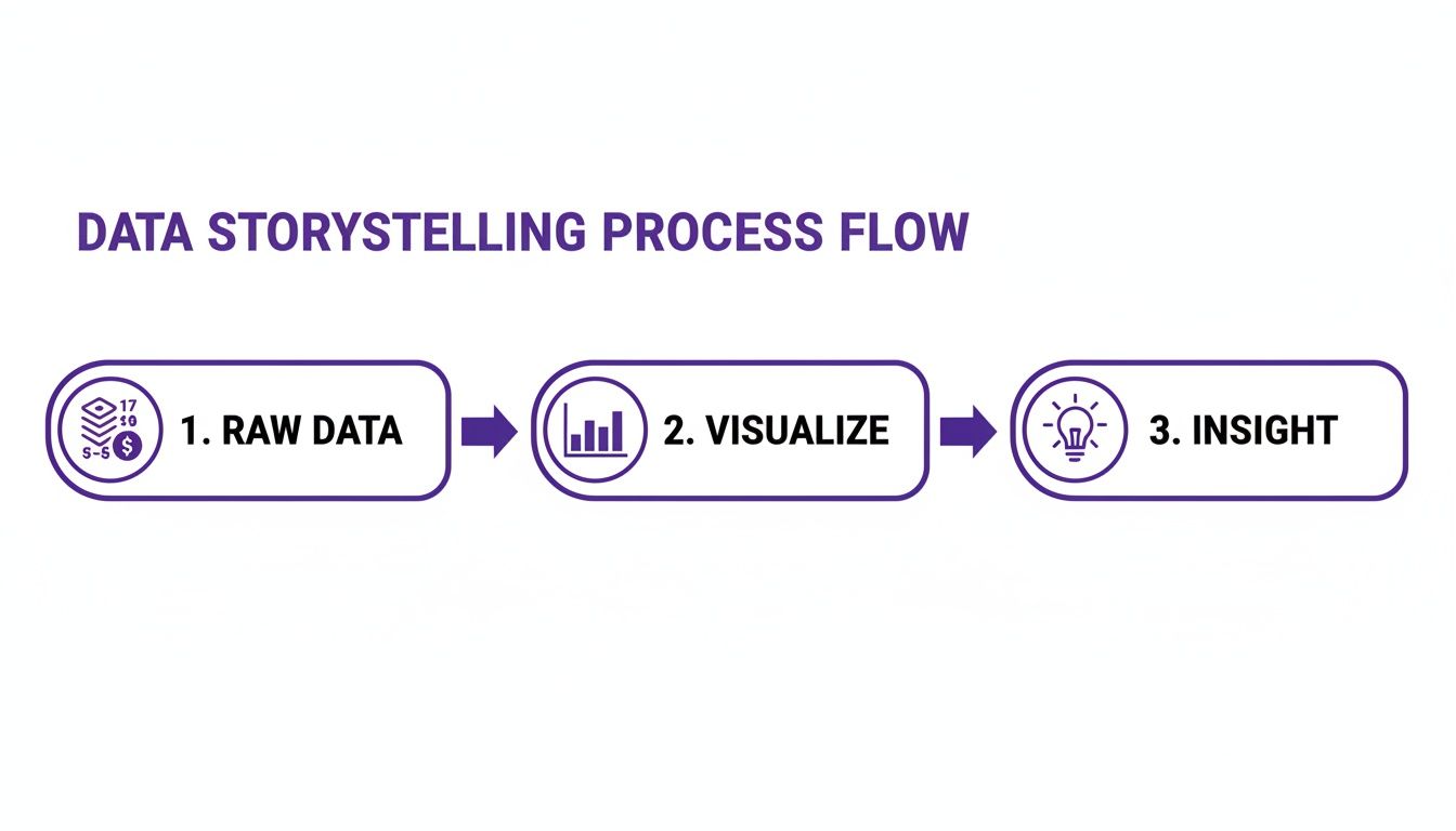
Trying to make sense of raw survey data in a spreadsheet is like trying to read a story written in code. It’s just numbers. But a good chart? That can tell you the whole story in a glance.
The real magic happens when you turn those complex survey results into simple, compelling visuals that anyone, from an engineer to your CEO, can instantly understand. This is a very important step in creating reports for surveys that actually get read and acted upon.
Think of it like choosing the right tool for a job. The chart you pick can either make your data’s story pop or fall completely flat. You have to match the visual to the specific insight you want to get across.
Choosing The Best Chart For Your Data
Different charts are built for different jobs. If you pick the wrong one, you risk confusing your audience or, even worse, leading them down the wrong path. Here are a few workhorses you can always rely on for survey data.
Bar Charts: These are your go-to for comparisons. Want to see how NPS scores stack up between your enterprise clients and your startup users? A bar chart shows that contrast immediately, making it perfect for segmenting your audience.
Line Charts: Got data you need to track over time? A line chart is your best friend. It’s the ideal way to visualize your CSAT scores month-over-month and see if those customer support changes are really paying off.
Pie Charts: Use these with a bit of caution, but they’re fantastic for showing parts of a whole. For instance, a pie chart can give you a quick, clean breakdown of your survey respondents by their subscription plan.
Building a clear visual narrative is also the heart of a great customer experience dashboard, where being able to find key metrics in seconds is non-negotiable.
Common Visualization Mistakes To Avoid
The goal is to create a report that delivers insights, not headaches. A misleading visual can cause more confusion than the raw data itself and lead to some seriously bad decisions.
One of the biggest blunders is using a misleading scale. If you start the axis of a bar chart at 50 instead of 0, you can blow tiny differences out of proportion, making them seem way more important than they actually are.
Another classic mistake is trying to cram too much information into one chart. A single visual with ten different colored lines doesn't look insightful; it just looks like noise. It's far better to create two or three simple charts that each tell one part of the story with absolute clarity.
If you really want to dig in and unlock the full potential of your survey reports, looking into tools designed for Business Intelligence with Power BI can be a game-changer. At the end of the day, it's all about clarity. Your reports should deliver insights quickly and effectively so your team can get to work.
Putting Your Survey Insights Into Action
A gorgeous survey report that just sits in a folder isn't doing anyone any good. It's a missed opportunity. The real magic happens when you connect the dots between what your customers are saying and the real-world improvements you can make to your SaaS.
This is about more than just data analysis. The goal is to build a closed-loop system where feedback directly triggers positive change, ideally, in an automated and scalable way.
Think of it as turning noise into a clear signal you can act on.
Raw numbers are just that: numbers. It's only when you visualize them that a story starts to form, one that you can actually find and use.
Use Cancellation Surveys to Reduce Churn
One of the most powerful reports you can build is one that digs into why customers are leaving. This is especially true in the hyper-competitive SaaS space, where the survey software market is expected to jump from USD 3.32 billion in 2025 to a massive USD 7.55 billion by 2034. Teams are investing heavily in these tools to fight churn head-on.
Imagine your report shows that 22% of cancellations come from users who feel the price is too high. That's a clear signal to build a churn deflection workflow. By hooking your survey tool up to a payment processor like Stripe, you can automatically trigger a personalized offer the moment a user selects "price" as their reason for leaving.
Instead of just waving goodbye to a valuable customer, you can hit them with an automated offer to pause their subscription for three months or switch to a more affordable plan. It's a simple, automated action that can make a huge difference in your retention numbers.
You can get more details on how other SaaS teams are using these strategies to keep customers around longer.
Turn Happy Customers Into Powerful Advocates
Survey reports can do more than just put out fires. High NPS or CSAT scores are a goldmine for spotting your biggest fans, the customers who are ready and willing to shout your praises from the rooftops.
Here’s a simple but incredibly effective playbook:
- Identify Promoters: First, set up a workflow that automatically flags any user who gives you an NPS score of 9 or 10.
- Automate the Ask: A day or two after they send in that glowing review, have an automated email go out to them.
- Request a Review or Case Study: In that email, thank them for their kind words and ask if they’d be willing to share their experience on a public review site or even participate in a case study.
This hands-off process helps you consistently generate social proof, which is pure gold for your marketing and sales teams.
Streamline Your Onboarding Experience
Let's be honest: a clunky or confusing onboarding process is a fast track to user abandonment. Your onboarding survey report is the perfect tool for pinpointing exactly where people are getting stuck.
Look for the patterns. Are users constantly getting tripped up on a specific step? Are they struggling to find a key feature that delivers that "aha!" moment? Once you spot these friction points, you can make targeted fixes. Maybe you need to rewrite some instructions, add a quick tutorial video, or just simplify a complex step.
By using your survey report as a roadmap, you can create a much smoother, more intuitive experience that gets new users up and running faster. This directly leads to better activation rates and less of that dreaded early-stage churn.
Got Questions About Survey Reports? We’ve Got Answers.
Even with the best tools in hand, turning raw survey data into something useful can bring up a lot of questions. Let's tackle some of the most common ones we hear from SaaS teams to help you get more from your customer feedback.
How Often Should We Be Generating Survey Reports?
There’s no magic number here; the right frequency completely depends on the type of survey you’re running. A one-size-fits-all schedule just doesn't cut it.
If you're running continuous feedback loops, like a post-support CSAT survey or a quick in-app poll, you need to be watching those results in near real-time. A live dashboard or a weekly summary is perfect for spotting sudden dips or spikes, letting you jump on problems before they snowball.
But for surveys tied to specific moments in the customer journey, the rhythm changes.
- Onboarding Surveys: A monthly review is a great cadence. It's frequent enough to spot trends in how new users are faring without getting lost in daily noise.
- Annual NPS Surveys: For these, a single, comprehensive deep-dive after the survey closes is the way to go. This is about finding long-term loyalty, not day-to-day fluctuations.
The goal is to find a rhythm that lets your team act on the information while it's still fresh and relevant.
What's The Biggest Mistake People Make With Survey Reports?
The most common trap, hands down, is creating reports that go nowhere. We’ve all seen it: beautifully crafted charts and compelling data that just sit in a folder. This is classic "analysis paralysis," getting great at collecting data but failing to do anything meaningful with it.
A report without a clear action plan is just a pretty document. To break the cycle, you need to build a culture of accountability around your findings.
For every key insight you pull from a report, assign it an owner. That person or team is now on the hook for figuring out the next step and setting a deadline. Remember, the whole point of a report is to spark improvement, not just to inform.
How Can AI Actually Make Survey Reporting Better?
AI is a total game-changer for survey reporting, mostly because it automates the difficult parts of analysis and uncovers insights you'd likely miss otherwise.
Think about all those open-ended comments. Instead of someone spending days manually reading and tagging thousands of them, AI can instantly categorize them by theme and sentiment. This frees up your team to think about strategy instead of getting bogged down in grunt work.
AI is also incredible at connecting the dots in ways a human analyst might not. It could, for instance, notice a link between low satisfaction scores and a specific user segment that just started using a new feature. It can even help predict which users are a churn risk based on their feedback, giving your team a chance to step in before it's too late.
What Do We Do With Conflicting Feedback In Our Reports?
First off, don't panic. Getting contradictory feedback is completely normal; in fact, it's often a goldmine of information. It's common for one group of users to love a new feature while another finds it clunky or useless.
The answer is segmentation. Stop looking at the overall average score and start slicing your data. Break down your reports by user persona, subscription plan, company size, or even product usage patterns.
This approach quickly reveals that you aren't building for a single, monolithic user base.
- You might discover that your power users are clamoring for more advanced, complex features.
- At the same time, your new users might be begging for more simplicity and better in-app guidance.
By segmenting your reports for surveys, you can build a roadmap that serves your most important customer groups without trying to create a one-size-fits-all product that ultimately pleases no one.
Ready to turn customer feedback into your biggest growth lever? Surva.ai gives you the tools to create insightful reports, automate churn deflection, and put your customer insights directly into action. Discover how Surva.ai can help your SaaS business grow.
Sophie Moore
Sophie is a SaaS content strategist and product marketing writer with a passion for customer experience, retention, and growth. At Surva.ai, she writes about smart feedback, AI-driven surveys, and how SaaS teams can turn insights into impact.