What Is Cohort Analysis for Boosting SaaS Retention
Learn what is cohort analysis and how to use it to understand user behavior, reduce churn, and drive sustainable growth for your SaaS business.

Ever get that feeling you're flying blind? Your top-line metrics, like total monthly users, are climbing. Everything looks great. But under the surface, a leaky bucket problem might be brewing, with new users pouring in one side and churning out the other.
This is exactly where cohort analysis comes in.
What is Cohort Analysis?
Think of it like tracking a graduating class. Instead of just looking at the entire school's performance year over year, you follow the Class of 2024 specifically. You see how their careers progress over the next five years, what jobs they get, and how successful they become. You're tracking a specific group, a cohort, that shares a common starting point.
In SaaS, instead of a graduation date, that shared characteristic is usually a signup date. You group everyone who joined in January, everyone who joined in February, and so on. Then you watch how each group behaves over time.

This simple shift in perspective moves you beyond vanity metrics to reveal the true story of user behavior. It helps you see if the users you acquired last month are sticking around or quietly slipping away.
A growth spike can look healthy on the surface while masking poor retention, weak activation, or low lifetime value. Without knowing how users behave after acquisition, teams risk optimizing for short-term gains instead of durable growth.
Why It Matters for SaaS
For any SaaS business, knowing your users is everything. Cohort analysis is your secret weapon for making smarter decisions because it isolates the impact of your actions.
It helps you get clear answers to important questions, such as:
- Did our new onboarding flow actually improve user retention for the cohort that experienced it?
- Do users who came from our Google Ads campaign stick around longer than those from our blog?
- Are customers who sign up during a holiday promotion more valuable over six months than those who sign up in a quieter month?
By answering these questions, you can double down on what works and fix what doesn't, creating a more engaged and loyal user base.
Cohort Analysis vs. Aggregate Metrics
So, why can't a metric like "total monthly users" tell you the same thing? The difference is depth. One gives you a 30,000-foot view, while the other gives you a detailed map of how different user groups navigate your product.
Here’s a quick comparison to make it crystal clear.
Ultimately, cohort analysis paints a much richer picture of your business's health. It’s the best way to truly find out about user loyalty and figure out what makes your best customers stay. Knowing this is the first step in learning how to calculate retention rate and building a more sustainable business.
Why Cohort Analysis Is Important for SaaS Growth
If you're running a SaaS business, just watching your total user count go up can feel great, but it's often a vanity metric. A rising user count looks fantastic on a dashboard, but it can easily hide a huge problem lurking beneath the surface: the "leaky bucket." This is what happens when you’re so focused on pouring new users in that you don’t notice the old ones quietly slipping out the back.
Cohort analysis is the tool that stops you from flying blind. It gives you the real story on the health of your user base.
Instead of looking at one big, blended churn rate for all your users, this method groups them into cohorts and tracks their behavior over time. Suddenly, you can connect what users do with what your team did. You finally get clear answers to the questions that will make or break your company's growth.
For instance, did that big product update in March actually make new users stick around longer? You can compare the March signup cohort to the February one and see for yourself. That’s a level of detail you’ll never get from aggregate metrics.
Pinpoint the Drivers of Churn and Retention
Cohort analysis helps you move from guessing to knowing. By comparing how different groups of users behave, you can finally isolate what’s working and what’s not.
You might discover that users who came from a specific webinar campaign have a 30% higher retention rate after three months than users from any other channel. Now that's an insight you can act on.
This knowledge lets you double down on successful strategies and helps you build a profile of your best, most valuable customers so you can go out and find more of them. By seeing exactly when certain groups tend to drop off, you can pinpoint friction in your onboarding or product and finally fix it.
Cohort analysis provides the evidence you need to make data-driven product decisions. It moves your team away from relying on gut feelings and building a product that people genuinely want to keep using.
This approach really became a turning point for SaaS companies back in the early 2010s as they fought to get a handle on churn. Pioneers like Buffer started sharing their retention tables publicly in 2012, and the numbers were a wake-up call. Their January cohort had 100% retention in the first month but plummeted to just 40% by month three. This kind of transparency helped founders realize that their high-level metrics were completely masking how loyal or disloyal their users actually were.
Forecast Revenue with Greater Confidence
One of the biggest headaches for any SaaS founder is trying to predict future revenue. Aggregate metrics make this feel like a guessing game because they don't account for the fact that different user groups stick around for different lengths of time.
Cohort analysis gives you a much clearer crystal ball.
By tracking the behavior and spending patterns of each cohort over its entire lifecycle, you can calculate Customer Lifetime Value (LTV) with far more accuracy. You can see how LTV changes for users who signed up after a price increase or the launch of a new feature.
This all leads to more reliable financial models and smarter budget decisions. When you know which acquisition channels bring in the most profitable customers over the long haul, you can allocate your marketing spend where it will have the greatest impact.
Of course, while cohort analysis is key for checking user behavior, you still need to bring new users in the door. Implementing effective SEO strategies for SaaS companies is a great way to fill your funnel with high-quality leads. When you combine smart acquisition with a deep knowledge of cohort performance, your growth becomes predictable and sustainable.
The Main Types of Cohorts You Should Track
To get meaningful answers from your data, you have to group users in ways that actually make sense for the questions you’re asking. While you can slice and dice user segments in countless ways, most cohort analyses boil down to two main types: acquisition cohorts and behavioral cohorts.
Getting the difference between them is the key to unlocking the right insights. One tells you when users joined, and the other tells you what they did.
Acquisition Cohorts
The most common starting point is grouping users by their acquisition date. This just means you create cohorts based on when users signed up for your product, whether that’s by the day, week, or month they joined.
For example, a "January 2024" cohort is simply every user who signed up that month. Acquisition cohorts are perfect for answering broad questions about your user experience over time. They create a timeline, letting you see if your product is getting better (or worse) at keeping new users around.
Here’s what you can learn by tracking acquisition cohorts:
- Overall Retention Health: Are newer cohorts sticking around longer than older ones? If so, your product improvements are likely paying off.
- Onboarding Effectiveness: By looking at weekly or even daily cohorts, you can see the immediate impact of changes you made to your signup or onboarding flow.
- Seasonality Effects: Do users who sign up during a holiday promotion behave differently over their first three months compared to users who join in a quieter period?
Acquisition cohorts are like a retention radar for SaaS founders. A Statsig benchmark across 1,000 apps showed that January cohorts retained 85% of users at Day 30 but slid to 45% by Day 90. In contrast, their June cohort, which joined after a major feature launch, held onto 62% of users at Day 90. That’s a 37% uplift, likely driven by better onboarding and a more valuable initial experience.
Behavioral Cohorts
While acquisition cohorts tell you when users arrived, behavioral cohorts tell you what they did. These groups are based on specific actions users take (or don't take) within a certain timeframe. This method is incredibly powerful for figuring out which actions correlate with long-term customer loyalty.
The possibilities here are pretty much endless. You can create groups based on almost any action inside your product.
Some common examples include:
- Users who used a specific feature (like "create a report") in their first week.
- Users who completed your full onboarding tutorial versus those who skipped it.
- Customers who contacted your support team within their first 30 days.
- Users who came from a specific marketing campaign (e.g., a Google Ads campaign versus an organic search).
By analyzing behavioral cohorts, you can identify your "aha!" moments—the key actions that turn new users into committed, long-term customers. When you know what those actions are, you can redesign your user experience to guide more people to them.
For example, you might compare the retention of users acquired through a Google Ads campaign versus those who came from an organic search. If the organic cohort has a much higher retention rate after six months, it might tell you that your content marketing is attracting a more qualified and engaged audience. That insight helps you decide where to invest your marketing budget for more sustainable growth.
To make it even clearer, let's break down how each cohort type helps you answer different kinds of questions. Think of this table as a quick reference guide for choosing the right lens for your analysis.
Types of Cohorts and What They Reveal
Ultimately, mixing and matching these cohort types will give you the richest, most actionable picture of your user base. Start with acquisition cohorts to get a baseline, then layer on behavioral analysis to find out the why behind the numbers.
How to Perform a Cohort Analysis
Running a cohort analysis might sound like something you'd need a data science degree for, but it's actually pretty straightforward. It is less about crunching complex formulas and more about asking smart questions and organizing your data in a way that tells a story.
Let's break it down into a few clear steps. The whole idea is to follow a structured process that takes you from a general business question to a crystal-clear, visual answer. We’ll even walk through it with a fictional SaaS company, "ProjectFlow," to make every step feel real.
Step 1: Ask a Specific Question
Every great analysis starts with a sharp, focused question. A vague goal like, "I want to see our user retention" is just too broad to give you anything useful. You need to get specific. A good question isolates a single variable you want to know about.
Let’s say ProjectFlow just launched a slick new in-app onboarding tutorial on February 1st. They want to know if it's actually helping.
A perfect question would be: "Did users who signed up in February (and saw the new tutorial) have better 30-day retention than users who signed up in January?"
This question is gold because it’s:
- Specific: It clearly defines the cohorts (January signups vs. February signups).
- Measurable: It zeroes in on a specific metric (30-day retention).
- Actionable: The answer will tell ProjectFlow whether their new tutorial was a success or a flop.
Step 2: Identify the Data You Need
Got your question? Great. Now, what data do you need to answer it? You probably don't need some massive, complicated dataset. For most basic cohort analyses, a few key pieces of information per user will do the trick.
For ProjectFlow's question, they’ll need just three things:
- User ID: A unique identifier for every person who signed up.
- Signup Date: The exact date each user created their account. This is the cornerstone because it's what defines their cohort.
- Last Seen Date (or Activity Date): A timestamp of the last time each user was active in the app. This tells you if they’re still sticking around.
With just these three data points, ProjectFlow can group users into January and February cohorts and see how many from each group were still active 30 days later. Simple as that.
Step 3: Segment Users into Cohorts
This is where you actually group your users based on that shared characteristic you defined back in step one. For ProjectFlow, this is super easy. They'll create two main groups.
- January Cohort: Every user with a signup date between January 1st and January 31st.
- February Cohort: Every user with a signup date between February 1st and February 28th.
This just involves filtering your user data by their signup date. Most analytics tools can handle this automatically, but you could easily do it in a spreadsheet with a simple filter. The goal is to end up with two clean lists of users, one for each month.
The infographic below shows the two main ways you'll group users: by when they signed up (acquisition) or by what they did (behavioral).
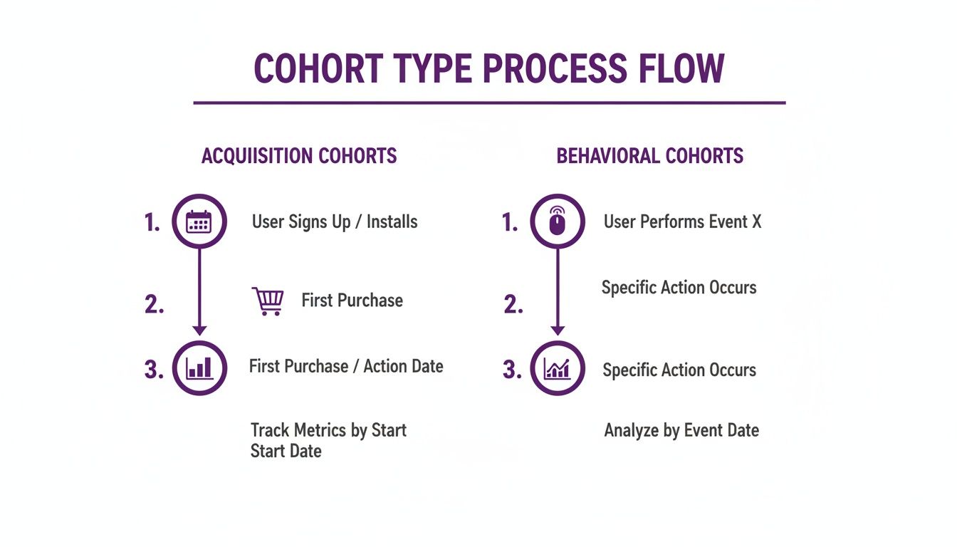
This visual breaks down how you can group users, either by their starting point or by specific actions they’ve taken along the way.
Step 4: Calculate Your Key Metric
Time to do a little math. Your goal here is to calculate the retention rate for each cohort over the time period you care about. The formula is simple:
(Number of users still active at the end of a period / Total number of users in the cohort) * 100
For ProjectFlow, they’d look at each cohort 30 days after signup. So, for someone who joined on January 15th, they'd check if that user was active around February 14th. If a user from the February 5th cohort was active on March 7th, they’re counted as retained.
After running the numbers for all users, they might find something like this:
- January Cohort: 1,000 users signed up. After 30 days, 350 were still active. Their 30-day retention rate is 35%.
- February Cohort: 1,200 users signed up. After 30 days, 540 were still active. Their 30-day retention rate is 45%.
These numbers already tell a powerful story about the impact of that new onboarding tutorial. You can track other metrics, too. If you want to go deeper, our guide on how to measure customer engagement can give you ideas for other important actions to track.
Step 5: Visualize the Data
The final step is to present your findings in a way that people can understand in a single glance. The go-to visual for this is a cohort chart, which is basically a table showing how retention changes over time.
For ProjectFlow, a simple comparison table nails it:
This simple table instantly highlights a 10-percentage-point improvement in retention for the group that went through the new onboarding. This kind of clear visualization turns raw data into a compelling story, one that justifies the product team's hard work and proves its value to the whole company.
How to Find Actionable Insights in Your Cohort Data
Putting together a cohort chart is a solid first step. But the real magic happens when you know how to read it. Without interpretation, the numbers are just noise. The goal is to turn that noise into a clear story about your users' journey to spot patterns, ask "why," and find real opportunities to make your product better.
Think of your cohort table as a map of user behavior. Each row represents a different group of travelers (your cohorts), and each column shows how far along they've made it over time. By scanning this map, you can pinpoint exactly where different groups get lost and which paths lead to them sticking around for the long haul.
Spotting Key Patterns in Retention Tables
At first glance, a cohort retention table can look like a wall of percentages. It’s intimidating. The trick is knowing what you're looking for, because certain patterns are dead giveaways for specific problems or successes in your user experience.
Here are a few common patterns and what they’re usually telling you:
A Steep First-Month Drop-Off: If you see a massive dip in retention in Month 1 across pretty much every cohort, you've got an onboarding problem. This is a huge red flag. It tells you that new users aren't finding the value they signed up for, they're getting stuck, or they just don't get how to start. Time to take a hard look at your welcome emails and in-app tutorials.
Improving Retention in Newer Cohorts: This is the pattern you want to see. If your retention rates get consistently better with each new group (say, the March cohort sticks around longer than February, who did better than January), you have strong evidence that your product updates are actually working. It’s validation that your team’s efforts are making the product stickier.
A Sudden Dip Across All Cohorts: Did retention suddenly tank for every single cohort in the same month, regardless of when they joined? This usually points to an external event or a negative product change. Maybe it was a widespread bug, a server outage, or a UI update that everyone hated. It’s a sign that something you did frustrated a huge chunk of your user base all at once.
Comparing Cohorts to Isolate Impact
The real power of cohort analysis is in the comparison. When you isolate different user groups, you can measure the direct impact of your business decisions and move from simply guessing to knowing.
Let's say you launched a big marketing campaign in April. To figure out if it brought in good, long-term users, you can compare the April signup cohort directly against the March signup cohort. If the April group has a much lower 3-month retention rate, that’s a clue the campaign attracted a lot of tire-kickers, even if it drove a ton of signups.
The same logic applies to product changes. Did you release "Feature X" in May? By digging into the data, you might discover that users who adopt that feature in their first week have a 30% higher 3-month retention rate. That’s a massive insight. It tells you to get more new users to that "aha!" moment as fast as possible.
The most actionable insights come from comparing two groups that are identical except for one key variable. This lets you confidently attribute differences in their behavior to that single change.
In behavioral analysis, segmenting by a user’s first action can be incredibly revealing. Grouping by acquisition channel is a classic example. A study of 500 SaaS firms found that cohorts acquired through email marketing retained 48% of users at Day 90, while those from social media only kept 32%. This 50% relative difference was so significant that it prompted teams to shift their budgets, which boosted overall retention. You can find more findings like this over at Datamation.com.
Ultimately, interpreting cohort data is like being a detective. Every number is a clue. Your job is to piece them together to uncover the full story of your users' experience and turn a simple data table into a powerful roadmap for growth.
Using Feedback to Improve Cohort Performance

Cohort analysis is fantastic at showing you what is happening with your users. It shines a spotlight on where the leaks are in your product and which groups are getting stuck. But it rarely tells you why.
To get the full story, you need to pair the quantitative data from your cohorts with qualitative insights, the kind you can only get by talking to your users. This is where targeted feedback becomes your secret weapon. Instead of blasting generic surveys to everyone, you can use your cohort data to ask the right questions to the right people, right when it matters most.
This creates a powerful cycle: analyze the data, gather feedback to understand it, and then make improvements that drive real growth.
Target Underperforming Cohorts to Diagnose Problems
Let's say your cohort analysis flags a big problem. The group of users who signed up in April shows a massive drop-off after just one month, way worse than any other cohort. The data tells you something is wrong, but it can’t explain the reason. Was it a confusing new feature? A pricing change? A nasty bug?
Instead of guessing, you can go straight to the source.
- Send targeted surveys: Set up an automated, brief survey that goes out to every user in that specific April cohort who has gone inactive. Ask them point-blank what caused them to stop using your product.
- Use cancellation surveys: For users in that struggling cohort who are actively churning, trigger a cancellation survey. Their feedback is pure gold for uncovering friction points.
- Look for patterns in the answers: As responses roll in, look for common themes. If 70% of respondents mention being frustrated with a new UI update, you’ve found your culprit.
By blending cohort data with direct feedback, you turn a vague problem like "high churn" into a specific, solvable issue like "users are confused by our new navigation menu." This clarity lets your product team focus on fixing what's actually broken.
Learn from Your Best Cohorts to Replicate Success
Feedback isn't just for putting out fires. It's also an incredible tool for finding out what makes your best customers tick.
Imagine a behavioral cohort of users, those who adopted "Feature Y" in their first week, has an off-the-charts retention rate. You know they're successful, but what is it about that feature they love so much? What makes it click for them?
You can survey this high-performing group to figure out what makes them stick around.
- Discover their "aha!" moment: Ask them what they were trying to accomplish with Feature Y and how it helped them get there.
- Gather powerful testimonials: Their positive feedback can be turned into compelling social proof for your website and marketing.
- Guide your product roadmap: Their insights can tell you how to make that feature even better or what kinds of new features would solve similar problems for other users.
This process, combining quantitative analysis with qualitative feedback, is the key to continuous improvement. For more ideas on how to manage this, you might be interested in our guide on closing the feedback loop effectively. By actually listening to what different user groups have to say, you can start making smarter decisions that boost retention for everyone.
Your Top Questions About Cohort Analysis, Answered
Even with the best guide, you're bound to have questions once you start digging into the data yourself. Let's tackle some of the most common ones that come up when teams move from theory to practice.
How Often Should I Run a Cohort Analysis?
For most SaaS companies, running a cohort analysis on a monthly basis is the sweet spot. This cadence is frequent enough to catch trends tied to things like product updates or new marketing campaigns, but not so frequent that you get lost in the noise.
That said, if your business has a really short user lifecycle or you're seeing a massive wave of new signups, a weekly analysis might give you a clearer, more immediate picture. The real key is to find a rhythm that matches the pace of your business and how quickly you make decisions.
What Are the Best Tools for Cohort Analysis?
You definitely don't need to break the bank on fancy software to get started. In fact, many of the best teams begin with tools that are simple but incredibly powerful.
- Spreadsheets: Google Sheets or Microsoft Excel are perfect for getting your hands dirty with the data, especially early on. They give you complete control and are a fantastic way to learn the ropes.
- Analytics Platforms: As you grow, dedicated platforms like Amplitude, Mixpanel, or even Google Analytics 4 are game-changers. They offer advanced, automated cohort features that save a ton of time.
- Business Intelligence (BI) Tools: When you're ready for deep, custom visualizations, tools like Tableau or Looker are the way to go. They let you build detailed cohort charts and dashboards that can tell a powerful story.
What Is a Good Retention Rate for a SaaS Cohort?
Ah, the million-dollar question. The honest answer is: it depends. A "good" retention rate varies wildly based on your industry, whether you're B2B or B2C, and even your price point. For a lot of B2B SaaS businesses, a monthly retention rate of 95% or higher is a sign you're doing something very right.
But the most important benchmark isn't your competitor's; it's your own. Your real goal should be to see retention rates for new cohorts consistently improving over time. That’s the ultimate signal that your product is getting stickier.
At the end of the day, what is cohort analysis? It's a lens for checking how groups of users stick with you over time. By getting these practical questions answered, you’re that much closer to making it a core part of how you grow.
Ready to turn your cohort data into actionable feedback? Surva.ai is an AI-powered survey platform that helps SaaS teams get the "why" behind their numbers. Send targeted surveys to specific cohorts, diagnose churn, and learn what makes your best customers stick around. Start reducing churn with Surva.ai.
Sophie Moore
Sophie is a SaaS content strategist and product marketing writer with a passion for customer experience, retention, and growth. At Surva.ai, she writes about smart feedback, AI-driven surveys, and how SaaS teams can turn insights into impact.