Guide: how do you analyse qualitative data for SaaS teams
Explore how do you analyse qualitative data in practice with a concise, actionable guide for SaaS teams to code feedback and identify themes.

So, what does it actually mean to analyze qualitative data?
It’s the process of taking non-numerical information, like interview transcripts or the text from open-ended survey responses, and systematically organizing it to spot patterns, themes, and insights. This is how you find the ‘why’ behind your users' actions, bridging the gap between raw feedback and smart business decisions.
Why Qualitative Data Analysis Matters for SaaS

Before getting into the "how," it's worth seeing its real-world value. While your quantitative metrics show you what users are doing inside your product, qualitative analysis tells you why they're doing it. For any SaaS company chasing growth and solid retention, that distinction is everything.
Imagine your analytics dashboard flags a 30% drop-off on the onboarding screen for a new feature. The numbers are screaming that something is wrong, but they're silent on what's causing it. Is the UI clunky? Is the page loading too slowly? Or did users expect a key integration that isn’t there? The quantitative data found the problem, but its job stops there.
The Story Behind the Numbers
This is exactly where qualitative analysis shines. By looking into feedback from user interviews, support tickets, and those open-ended survey fields, you can find the specific friction points. You might find a dozen comments saying, "I couldn't find the 'next' button" or "I was looking for a Zapier integration and didn't see one."
These direct quotes are gold. They transform an abstract data point into a concrete, solvable problem for your product and marketing teams.
Qualitative data provides the context that quantitative data lacks. It moves you from knowing what happened to knowing why it happened, giving you a clear path to improvement.
From Feedback to Strategy
The real value comes when you connect this raw feedback directly to smarter business decisions. This is about structuring feedback to see the patterns. When five different customers mention the same frustration or ten others request the same feature, you have a powerful signal for your product roadmap.
Here’s what that looks like in practice for a SaaS business:
- Improved Product Development: Pinpoint exact user frustrations to build features that people will actually use and love.
- Reduced Customer Churn: Get to the bottom of why customers are canceling and proactively address those core issues.
- Effective Marketing Messaging: Learn the exact language your customers use to describe their problems, which helps you create marketing campaigns that truly resonate.
By systematically analyzing qualitative data, you stop guessing what your users want and start building your strategy around what they're telling you directly. This creates a powerful feedback loop where customer insights continuously fuel product improvements, leading to higher satisfaction and, ultimately, better retention.
Getting Your Qualitative Data Ready for Analysis
Before you can start spotting those game-changing patterns in user feedback, you have to bring some order to the chaos. Proper prep work is the bedrock of any solid qualitative analysis. I've seen it happen time and time again: teams that rush this stage end up with a classic "garbage in, garbage out" problem, where messy data leads to insights you just can't trust.
First things first, you need to pull all your qualitative data out of its various digital homes. For any SaaS company, this feedback is usually scattered all over the place. You might have customer support chats from Intercom, detailed answers from survey tools, and rich transcripts from user interviews or sales calls. Getting everything into one place is the only way you’ll start to see the bigger picture.
Once all the raw data is gathered, it’s time to clean it up and give it some structure. This is all about making the information consistent and easy to work with.
Standardize Your Data Format
Your main goal here is to get every piece of feedback into a single, uniform layout. A simple spreadsheet is usually your best friend for this. Create a few columns to capture the context for each piece of feedback; this will be a lifesaver later on.
I always recommend starting with these columns:
- Source: Where did this feedback come from? (e.g., "Intercom Chat," "NPS Survey," "User Interview")
- Date: When did you get this feedback? This is brilliant for spotting trends over time.
- User Segment: Who is this person? (e.g., "New User," "Power User," "Canceled Account"). This detail is very important for slicing and dicing your findings.
- Raw Feedback: The original comment, transcript snippet, or survey response. Copy and paste it exactly as it was written.
- Notes: A spot for your gut reactions, initial thoughts, or any other relevant context.
This structured approach makes your dataset instantly searchable and sortable, which is a massive help once you get into the real analysis. For example, you could easily filter down to see everything "New Users" said in "Intercom Chats" last month.
Anonymize and Consolidate
A very important part of the cleanup process is anonymization. You have to protect your users' privacy by removing or redacting any personally identifiable information (PII). That means names, email addresses, company names, or any other sensitive details. This is not just about respecting your users; it's about staying compliant with data privacy laws like GDPR.
With your data cleaned and anonymized, the final prep step is to pull it all together into a master document. Having a single source of truth prevents so much confusion and makes the whole analysis process way smoother. Instead of hopping between different files and platforms, your team has one organized dataset to work from.
Key Takeaway: A well-prepared dataset is your biggest asset. Taking the time to gather, structure, and clean your qualitative data makes sure that the insights you find are accurate and trustworthy.
This groundwork really does set you up for success. It transforms a jumble of comments and conversations into a structured asset, ready for you to explore. If your data comes from surveys with a mix of question types, you might find our guide on crafting effective open-ended research questions useful for future data collection.
With a solid foundation in place, you're ready to pick your analysis method.
Applying Thematic Analysis to User Feedback
So, you've got all your user feedback neatly organized. Now what? It's time to pick a method to start finding the gold—the actual patterns hidden in all that text. For SaaS teams, one of the most practical and flexible approaches out there is thematic analysis.
Think of it as a systematic way to identify, analyze, and report back on the core ideas, or "themes," that keep popping up in your user feedback. It’s perfect for turning a mountain of raw comments into a handful of clear, actionable insights.
Thematic analysis is popular for a good reason. It doesn't require a deep background in stats or a rigid theoretical framework to get started. A 2023 meta-analysis covering 500 studies found it was the go-to method in 48% of cases across different fields. It’s a practical way to genuinely make sense of what your customers are trying to tell you.
From Raw Comments to Actionable Themes
Let's walk through a real-world scenario. Imagine your team just rolled out a beta version of a new analytics dashboard. You've collected 100 pieces of feedback from your early testers through surveys and in-app messages. Right now, it’s probably just a messy, overwhelming list of comments.
Thematic analysis gives you a structured path to turn that mess into a clear summary of user sentiment. You start by simply reading through all the feedback. No heavy lifting yet. This first pass is all about familiarization, just absorbing what people are saying and getting a feel for the general vibe.
Once you have a handle on the data, you can move on to the real work: coding.
Identifying Initial Codes in Your Data
As you read through each piece of feedback for the second time, you'll start noticing specific, recurring ideas. The goal here is to assign short labels, or "codes," to capture the meaning of each point.
Let's stick with our beta dashboard example. Your first few codes might look something like this:
- "The main chart takes forever to load." → Code: slow loading time
- "I couldn't figure out where to change the date range." → Code: confusing UI
- "It would be great if this connected to our HubSpot data." → Code: missing integration
- "The colors on the graph are hard to distinguish." → Code: poor data visualization
You’ll continue this process for all 100 comments. Don't stress about having too many codes at this stage. The main thing is to capture every significant point people are making.
Pro Tip: Consistency is your best friend here. If you use "slow loading time" for one comment, use that exact same code for similar feedback later on. A simple codebook in a spreadsheet can be a lifesaver for tracking your definitions and keeping things tidy.
This whole process starts with gathering raw data, structuring it, and then consolidating it before the analysis can even begin.
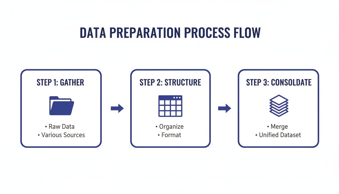
This initial prep work is what turns scattered, messy feedback into an organized dataset that’s actually ready for coding.
Grouping Codes into Broader Themes
Okay, so you've coded all your data and now you have a long list of labels. The next move is to look for relationships between these codes and start grouping them into broader, overarching themes. A theme is basically a pattern in the data that points to something important about the user experience.
It’s a bit like organizing a messy closet. Your codes are the individual items: shirts, pants, shoes. Your themes are the categories you create to bring some order to the chaos, like "work clothes," "gym wear," and "formal attire."
Looking at our example codes, you might start to see some obvious groupings:
And just like that, the scattered feedback starts telling a coherent story. Instead of dealing with 100 individual comments, you now have three clear, high-level problem areas that your product team can immediately understand.
This is where the real value of this analysis method comes into play. It takes you from a sea of opinions to a handful of strategic insights. You can now walk into a meeting and say, "Our beta users are running into performance bottlenecks and usability issues, and they're asking for more integrations." Now that's an actionable starting point for making your product better.
Choosing Your Coding Method: Spreadsheets vs. AI Tools
Okay, so you’ve waded through the data, done your first pass with thematic analysis, and have a list of initial codes. Now what? You have to actually manage all of it. This next part is the coding process, where you start systematically tagging and categorizing every last bit of feedback. The way you decide to tackle this can make a huge difference in how quickly and effectively you get to the good stuff—the insights.
You really have three main paths to choose from here. You can go old-school and do it all manually, use a trusty spreadsheet to keep things organized, or bring in some modern AI-powered software to help out. Each approach has its place, and the right one for you will depend on how much data you're dealing with, your budget, and how your team likes to work.
The Manual and Spreadsheet-Assisted Routes
If you’re working with a smaller, more intimate dataset, say, feedback from a dozen user interviews, a manual approach or a well-structured spreadsheet can work beautifully. There's a certain magic to this hands-on method. It forces you to get up close and personal with your data, which often leads to a much richer, more nuanced view of what your users are telling you.
I often point people to a simple spreadsheet template to get started. It adds just enough structure without overcomplicating things.
Here’s a basic layout you can copy and adapt:
The beauty of this method is that it’s cheap and accessible. If you have Google Sheets or Excel, you're good to go. The biggest drawback, though, is scalability. Once your dataset starts to grow, keeping track of codes, making sure everyone on the team is consistent, and just trying to spot those bigger patterns becomes a real headache.
Leaning on AI-Powered Tools
This is where AI-assisted software really shines. Tools like NVivo, Dovetail, or ATLAS.ti were built from the ground up for exactly this kind of work. They’re designed to chew through huge volumes of text, like thousands of app store reviews or hundreds of open-ended survey responses.
If you're thinking about using AI, it’s worth taking a look at platforms that can really accelerate the whole process. For example, you could explore AI-powered solutions like Parakeet AI to get a sense of how they automate parts of the workflow.
These platforms use natural language processing (NLP) to do a first pass, suggesting initial codes and themes that can save you a ton of time. Traditional manual methods just can’t compete when you’re dealing with data at scale. Manually slogging through 2,000 survey responses could take you weeks, but the right tool can cut that down to just a few days. In fact, research shows that a blended approach, letting AI do the initial heavy lifting, can be 55% faster than a human working alone.
For a SaaS company with a constant firehose of user feedback, that kind of efficiency is a game-changer. You can analyze feedback more often and keep a real-time pulse on how your customers are feeling. Our guide on customer sentiment analysis tools goes into more detail on platforms that can help with this.
AI tools don't replace the researcher; they act as a powerful assistant. Your expertise is still needed to validate the AI's suggestions, interpret the context, and find the deeper meaning behind the data.
Making the Right Choice for Your Team
So, which way should you go? It really comes down to balancing a few key factors. AI-powered tools give you incredible speed and scale, but they come with subscription costs and a learning curve. Spreadsheets are free and familiar, but they can quickly become a tangled mess on larger projects.
To help you decide, I've put together a table that breaks down the pros and cons of each approach.
Comparison of Qualitative Data Coding Methods
This table compares the three main approaches to coding qualitative data: manual, spreadsheet-assisted, and AI-powered tools, helping you choose the best fit for your project.
Ultimately, there's no single "best" method that fits every project. A lot of teams I've worked with land on a hybrid approach. They might use an AI tool for the first broad pass on a massive dataset, then switch to a more focused, manual review in a spreadsheet to really dig into the nuances of a critical theme.
The goal is to pick the tool that helps you get from a mountain of raw data to clear, actionable insights as efficiently as possible.
Turning Themes into Actionable Business Insights

You’ve done the heavy lifting and pulled out the key themes from your qualitative data. That’s a huge milestone, but the job’s only half done. An insight that just sits in a spreadsheet doesn't help anyone. The real value comes when you translate those patterns into specific, concrete actions that actually improve your product and keep customers from walking away.
This is where your analysis connects back to real business goals. It's time to move from "here's what users are saying" to "here's what we should do about it."
For instance, say you consistently see the theme "Poor Onboarding Support" popping up in feedback from new users. On its own, that’s just a label for a problem. The next logical step is to figure out what it would actually take to solve it.
From Theme to Recommendation
Turning a theme into a solid recommendation means you need to put on your strategist hat. The goal is to propose clear, actionable next steps that your product, engineering, or customer success teams can grab and run with.
Let’s stick with the "Poor Onboarding Support" theme. What could that actually lead to?
- Product Improvement: "Develop a new interactive product tour that guides users through the first three key actions."
- Content Creation: "Create a dedicated onboarding video series and a getting-started guide for the help center."
- Process Change: "Assign a dedicated onboarding specialist to high-value accounts for their first 30 days."
- Support Enhancement: "Set up a dedicated support channel in-app specifically for new users during their trial period."
See the difference? Each one is a specific, testable solution directly tied to the user feedback you just analyzed. You've turned a vague complaint into a set of potential projects for the roadmap.
Your goal is to make it impossible for stakeholders to ignore your findings. Presenting a problem alongside a clear, well-reasoned solution is far more powerful than just pointing out what’s broken.
This direct line between user feedback and business action is also a powerful way to improve retention. By fixing the exact issues that cause friction, you’re much more likely to keep users happy and engaged. To learn more about this, check out our guide on the key customer retention metrics you should be tracking.
Presenting Your Findings to Stakeholders
How you share your insights is just as important as the insights themselves. Your audience, whether it's the CEO, the head of product, or the engineering team, is busy. You have to make your results compelling, easy to digest, and impossible to misinterpret. Forget the long, text-heavy reports. Visuals are your best friend here.
A few simple data visualizations can tell a powerful story in seconds, and you don’t need to be a data scientist to make them effective.
Here are a couple of practical ways to visualize your themes:
- Simple Bar Charts: This is one of the easiest and most effective ways to get your point across. Create a bar chart showing how frequently each theme appeared. This immediately shows stakeholders which issues are hitting the most users. A chart that clearly shows 75% of negative feedback falls under "Performance Bottlenecks" makes a much bigger impact than just saying it's a common problem.
- Mind Maps: When you need to show how different themes and sub-themes are connected, a mind map is an excellent tool. You can put a core issue like "User Churn" in the center and branch out to the contributing themes you uncovered, such as "High Price," "Missing Features," and "Usability Issues." This helps everyone see the bigger picture and how different problems might be feeding into each other.
By translating raw themes into specific recommendations and backing them up with clear visuals, you close the loop on your analysis. You’ve officially moved from just listening to user feedback to actively using it to build a better product and a stronger business.
Common Questions About Qualitative Analysis
As you get into analyzing qualitative data, a few questions pop up time and time again. Getting these sorted out early will make you feel more confident and keep your project from hitting a wall. Let's tackle some of the most common hurdles I see teams run into.
How Large Should My Sample Size Be?
This is the big one, and the answer is a bit unsatisfying at first: there’s no magic number. Qualitative analysis is all about the depth and richness of what you’re hearing, not about hitting some statistical quota.
The real goal is to reach thematic saturation. That’s the point where you stop hearing new ideas, themes, or major pain points from the people you’re interviewing. For a lot of SaaS projects, like looking into feedback on a single feature, you can often get there with as few as 10-15 really solid, in-depth user interviews. It’s always about the quality of your participants, not the sheer quantity. Start small, analyze as you go, and keep going until the insights start repeating themselves.
What Is the Difference Between a Code and a Theme?
It’s really easy to get these two mixed up, but telling them apart is important for making sense of your data. Think of it like building something with LEGOs.
A code is a single LEGO brick. It's a short, descriptive label you slap onto a specific bit of data, a sentence, a phrase, to capture its core meaning. Think "login issue" or "slow report generation."
A theme is the final creation you build with those bricks. It’s a bigger, overarching pattern or idea you discover by grouping a bunch of related codes together.
So, your individual codes like "login issue," "password reset failed," and "2FA not working" would all click together to form the larger theme of "Account Access Problems." Codes are the raw, foundational pieces; themes are the meaningful structures you build from them.
How Can I Reduce Researcher Bias in My Analysis?
Bias is a real challenge because we’re all human. We bring our own assumptions and perspectives to the table whether we mean to or not. The trick is to build a process with checks and balances that keep you honest and grounded in what the data is actually saying.
One of the best ways to do this is with triangulation. It sounds fancy, but it just means looking at the same question from multiple angles. If your interviews suggest a theme around "poor customer support," don't just take that at face value. Go check your support ticket data, NPS comments, and maybe even public reviews. If they all tell a similar story, you know you're onto something real.
A great practical step is to have a colleague independently code a small portion of your data without seeing your codes first. Then, compare notes. Discussing the differences in how you each interpreted the same feedback is a fantastic way to make sure your themes are genuinely emerging from the data, not just your own head.
While we're focused on qualitative data here, exploring broader data analysis discussions can give you even more tools for ensuring objectivity.
What Do I Do with Conflicting or Contradictory Data?
Don't panic! Finding data that contradicts itself isn’t a sign your project is failing. In fact, it's usually a sign that you're uncovering something really important. It almost always means different types of users are having wildly different experiences with your product.
Instead of trying to smooth over these contradictions, lean into them. Dig deeper. Who said what? You might find that your power users absolutely love a complex feature that new users find totally overwhelming. This is pure gold. It’s the kind of insight that helps you create personalized onboarding flows, build different user paths, or rethink a feature's design to serve everyone better. Don't toss out the outliers, they often have the most valuable lessons to teach.
At Surva.ai, we help SaaS teams like yours turn this kind of feedback into actionable insights that reduce churn and drive growth. Learn how our AI-powered platform can streamline your entire feedback analysis process at https://www.surva.ai.
Sophie Moore
Sophie is a SaaS content strategist and product marketing writer with a passion for customer experience, retention, and growth. At Surva.ai, she writes about smart feedback, AI-driven surveys, and how SaaS teams can turn insights into impact.